Thursday, April 14, 2016

Create And Earn Tip #8 - Monetary Value For Text-Only Graphics

It can be intimidating to look at any POD website's marketplace.  For the most part, they are full of awesome art work; enough to make you think you will never be able to replicate something like that.  Or at least that's how I used to feel.

As I've touched in the past, I learned my trade by trail and error.  The first thing I learned was that at the time I wasn't able to create any decent graphics.  To my rescue came the concept of text-only images.  I wasn't able to draw, or take a somewhat presentable picture, but I could type and be smart about it.

After that, I discovered people not only bought beautiful graphics, they also bought funny, inspirational, or encouraging sentences.

In this Create And Earn Tip we are going to cover how to create a text-only graphic others will find valuable.

Step 1- Have a defined target market
As with any image you create, the most important part in it is the person at the other end of the screen who is going to press that "Add to My Cart" button.  They are the ones who need to think your creations are worth the commission you'll be getting, not your friends, family, co-workers, etc, etc.

I already touched on the concept of having a defined target market in a previous tip I wrote.  You can check it out HERE or you can keep on reading.

To developed a defined target market you just need to answer these two questions:

"Who is going to buy my images?"
and
"Why are they going to buy those images?"

If your answers to these questions are:

Engineers and because they feel proud to be engineers.

Then the next step is to come up with a sentence an engineer will find encouraging, something that will make him/her feel pride in his/her occupation.  It is not that difficult.  Just think of what an engineer has to go through everyday.  Engineers basically solve problems everyday, all day.

Here is a little example of what I'm talking about.  Try showing an engineer or engineering student these sentences and see if they like them or not.

"Have problems?  No need to worry, I'm an engineer".
Or how about this one:
"I don't fear pain.  I was/am an engineering student"

Both sentences are directed to engineers and one to just engineering students.  And both sentences relate to what they go through everyday or what they went through in the process of becoming engineers.

On top of that, there's that positive emotion of pride both sentences were designed to induce.  Do you think an engineer or someone related to an engineer will find value in those sentences?  I'm pretty sure they will.

Never write a text-only graphic without knowing clearly who and why is going to purchase your work.

Having a well defined target market will take you a long way.  The best part of it is that you can have more than just one target market.  Therefore increasing the chances of someone buying your images.

Step 2 - Avoid filters
No, I don't mean filters like the one in your car, although in a way, I kind of do.  Sometimes filters can be good.  Example, an air filter in your car.  It keeps away dirt particles that will damage your motor over time.  Some other times filters are bad.  Example, the kind of font you used to write your text-only graphics.  If you picked the wrong font, others will not find it beautiful.

The worst mistake you can do when it comes to selecting a font, is to use a font that's difficult to read.  No one will find the value in your graphics if they have a hard time understanding them.

Nowadays, I tent to stick with simple and easy to read fonts like Times New Roman.  I can still remember my English teacher back in high school emphasizing how we were supposed to only use Times New Roman font when turning in our essays.  He made a comment about not wanting to spend more time trying to decipher what we wrote than to actually read our essay.

Also, don't forget to use an adequate color for your font.  Remember that with text-only graphics, the main purpose is to get your message across.  Try to use dark font colors when you're planing to use a bright background, and apply light colors when designing for dark backgrounds.

Another filter you'll find in the text-only graphics world is that of misspelling.  No one wants to wear a shirt that says:

"I love cats because their the best" 
or
"I love you because your my everything"

Take the time to double check your spelling.  There are countless of on-line dictionaries.  Over time you will memorize the proper spelling of each word.

Step 3 - Don't forget you're writing for your target market, not others
Sooner or later you'll find people who will not find value in your text-only graphics.  And they are going to have a great time pointing out how you're not a real artist and how your work sucks.

Once I got an email from some other designer in one POD website where I have a store.  He/she said:

"Does Anyone actually buy those god-awful t-shirts of yours? lol"
(Yes he/she wrote: Anyone instead of anyone)

Clearly this individual went over my work and found a bunch of white t-shirts with black writing on them.  On top of that nothing of what I wrote was funny because I can't be funny to everyone.  Some people like my humor, some hate it.  And that's fine.  I can only wonder why this person decided to contact me if he/she thinks my t-shirts are "god-awful".

I think maybe he/she was having a slow week and wasn't seeing as many sales and decided to check why.  He/she found my work and assumed his/her slow days were the result of my work and he/she decided to try to make fun of me.

I don't know why this person did what he/she did, but when I first got his/her message over two years ago, I went over to check their work and found some nice graphics.  Sadly, today, when I went to my mailbox to pull out their message, I found out he/she had closed his/her store.  Maybe sales really dried up.  Maybe someone said his/her work sucked.

No matter what others think of your text-only graphics, always keep in mind that if you're writing for a defined target market, your work will always have value to someone in this planet.  Don't listen to those outside your target market.  Keep on giving value to those you're designing for.

**********

And once again, we have come to the end of another Create And Earn Tip.  Please follow the three steps I covered and I'm 100% sure you'll start creating text-only graphics that will put a smile on someone else's face.

I hope you have found value in the preceding paragraphs.  Please write down your questions or comments in the box below.  I'll be more than happy to hear any suggestions you may have to help us make this blog better.
Thursday, March 24, 2016

Wednesday, February 24, 2016

Create And Earn Tip #7 - Adding Your Work To Redbubble

Now that we have covered some of the most important concepts when it comes to selling your work via POD (print on demand) websites, it's time to learn how to actually put your work out there.

Most POD websites I work with are pretty simple to use and there's not much to it.  Perhaps the two exceptions would be Zazzle and Spreadshirt.  But for this article we are going to stick to Redbubble.  Later, similar posts concerning adding work to Zazzle, CafePress, Skreen and Spreadshirt will be created.

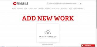
To begin type in your browser www.redbubble.com.  You should already have a RedBubble account.  It is free and fairly simple to set up.  Click the "Add New Work" button and you should be taken to a screen that looks like this:

(Click on the image to enlarge)


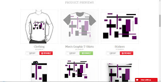
Click on the "Upload to all products" link and choose the image you wish to add.  For this demonstration, I'm using an image from my Rectangular Patterns collection.  After the image is done uploading, a preview of all the products with your image on them already should appear:


Underneath every product you will find two buttons.  One for editing and another for enabling or disabling a specific product.  The editing button is used to adjust the size and to rotate your image on the chosen product.  There you can also chose the view your potential costumers will first see.


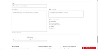
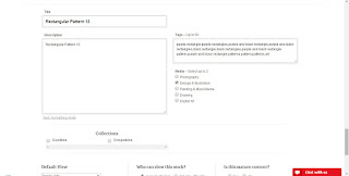
After you're done editing and adjusting the image on all the products you wish your image to appear on, keep scrolling down.  You'll find a section where you'll be able to write down the title, description, tags, and chose the media for your graphic.


Fill out all those details  and keep scrolling down.


Finally, you will find the last sections.  There you can set up the default view (which product will customers see first), audience (if it is a private or public product), and if the graphic contains mature content.  After you're done doing that, just press the Save Work button and wait.


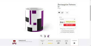
Processing time depends on how big or small your image is.  But after all is done, a new page with your graphic on the desired product should appear.


And just like that, you have added your work to the market place.  If it has any sort of value to other people, you can just sit back and wait for it to be purchased.  Or better yet, you can add even more work.

And this was our Create And Earn Tip for today.  Pretty simple, eh? As always, I hope you've gotten as much value from it as I intended to give.  Don't forget to ask any questions in the comment section.  I'll be more than happy to answer them.  Also, please help us out by sharing this blog via any social media website.  It means a lot to us.


Wednesday, February 17, 2016

Black And White Cityscape 13

A special thanks to Dimitrios for the purchase of a copy of our Black And White Cityscape 13 picture

Black And White Cityscape 13 Poster
Black And White Cityscape 13 Poster by Supernova23a
Shop for a Poster template or design online at Zazzle.com

Create And Earn Tip # 6 - What To Do When Sales Are Slow

It doesn't matter who you are, sooner or later you will experience a slowing down on sales.  You can be a big company making millions, or just a simple hobbyist earning $50 a month, but it will happen to you.  What do you do now?  What do you do to help sales pick up speed again?

In order to understand why sales have slowed down, first you need to understand why your graphics are being purchased in the first place.  If you understand this, you'll be able to take the steps necessary to get out of this situation.

Take an honest look at your graphics and decide if they are "timeless" or "seasonal".

TIMELESS GRAPHICS
Timeless graphics are those graphics that don't contain a reference to a particular day or week of the year.

A good example of a timeless graphic would be the picture of a beautiful lake.  Regardless of the time of the year, that particular image will have monetary value because it is pretty.  It doesn't matter if it is snowing outside or if you live in the desert where the temperature is 110 degrees.  Anyone, at any day of the year, can look at that picture and find it valuable/beautiful.

Another example of a timeless graphic would be a phrase or slogan that has no reference to a particular date in the calendar.  A graphic with the sentence: "Proud parent of a lazy teenager" will be funny  any day.  And people who have lazy teenagers at home will identify with it and therefore would want to purchase it regardless if it is November or May.

SEASONAL GRAPHICS
These are the opposite of Timeless Graphics.  Well, not quite.  Seasonal graphics have a reference to a particular day or week in the calendar, and therefore are more in demand around that period of time.

The perfect seasonal graphic would be anything with the image of Santa Claus in it.  What do we all think when we see Santa Claus? Christmas, right?

If you have a bunch of images with seasonal themes, it would only make sense that sales would slow down when we are not in that particular time of the year.

Of course, there are always exceptions for everything in life.  Sooner or later you will get someone to buy your Christmas graphics in the middle of June.  But look at these sales as what they are:  the exception and not the rule.

I recommend creating more timeless and less seasonal graphics if you want to see sales pick up again.

So you have looked into your portfolio and have determined you have more timeless than seasonal images, but sales are still dropping down.  I can't say I have every answer, I certainly don't.  However, over the years I've tried a couple of things when sales are slow and this is what has worked for me.

1.  Comment on products that have been purchased.
One day I noticed the same design kept selling, but only sporadically.  In order to keep track of it, I went to the comment section of that particular design and wrote:  "Dear Unknown Buyer, thanks for your purchase".  Few days later, I got an email saying that design had been purchased again.  I wrote the same comment and did the same with some other designs that had sold that same day.  To my surprise, they kept selling.  I started the habit of writing a little thank you note in the comment section of every design someone purchased.

I don't really know how things work, but may be a design with two, three or more comments will be more popular in search engines.  This will increase it's ranking and will have a bigger chance of appearing on the top spots when someone runs a search.

2.  Study your target market.
The subject of a target market is a long one.  And I will write a whole post about it some other day, but for now I'm going to keep it short.

If you don't know what a target market is, here is my definition:  The group of people who will purchase your graphics.  As simple as that.  If people stopped buying your graphics, there's a reason for that.  Sometimes it is a complex reason, others it may be a simple one.

For the sake of time, I'm going to stick with the simplest thing you can do regarding to "studying your target market".  That is, defining your target market.  If you don't have a well defined target market, you'll be shooting bullets into the dark.  You won't know what you hit, and you won't know if you'll ever hit it again.

The way I defined my target market was pretty simple and effective.  I started with a segment of the population with purchasing power.  Example: lawyers.  Then I though of a reason why a lawyer would purchase one of my graphics.  Example: because lawyers studied a lot to become lawyers and they feel pride for their profession, and my graphic makes them feel just that.  After having that concept clear in my mind, I came up with a line like this:

"Without lawyers the world ends"

And that is one of my most popular slogans related to lawyers in my store.

If you can answer these two questions:

"Who will buy my graphics?"
and
"Why will they buy my graphics?"

You will have a defined target market.  As I said before, the subject of a target market is a long and kind of complex one.  I'll write a complete article related to this matter, but for now we're going to stop here.

3.  Do your best.
I talked on this subject on the first Create And Earn Tip, however, I'm going to mention it here again just to highlight how important it really is.

Work on improving your existing designs and work on how to create better graphics.  Learn new skills if necessary.  If you're into selling drawings of flowers, but you know there are better artists than you out there, it's time to go learn their secret.  Do whatever it is necessary to help you create better graphics.

Make friends with people who are more advanced than you, take a class on how to take better pictures, on how to draw better; watch some tutorials on YouTube.

Do your best on developing your skills.

***************

I'm going to end this Create And Earn Tip with a simple thought.  

When sales are slow it is time to look at you and your work.  Try to figure out what you have done wrong, and how you could fix this.  It is easy to blame others, but to find our own flaws is the right thing to do.

As always, I hope you've gotten as much value from this post as I intended to give.  Your questions and comments are greatly appreciated.

Help me out by sharing this blog.

Tuesday, January 19, 2016

Black Cat 3

A special thanks to Dawn for the purchase of one copy of our Black Cat 3 picture, and to my cat Tomas for modeling for such picture.
Black Cat 3 Tri-fold Wallets
Black Cat 3 Tri-fold Wallets by Supernova23a
Check out other Black cat Wallets at zazzle.com